BRAND NAME / BRAND IDENTITY DESIGN / BRAND EXPRESSION SYSTEM / WEBSITE DESIGN
Creative Signage/hoarding Company
Branding Case Study
Project Background: The owner of the Pribox wanted to create a website which can help business build a Brand by providing them quick ACP SIGNAGE SOLUTIONS at one place without having to reserach everywhere. They wanted to keep it minimal solution to it. So they approached Popway Innovation LLP for their project & we immidiately knew what was needed to be done.

Brand Archetype
The Creator
A Creator brand is a visionary that innovates and disrupts, often offering a solution to a very modern problem or situation. They’re bold and never afraid to try new things.
Imaginative | Creative | Authentic | Promising | Expressive | Perfectionist
Archetype Values: Imaginative | Outside-the-box thinking | Passion I Self-expression
Brand Naming
Lorem Ipsum is simply dummy text of the printing and typesetting industry. Lorem Ipsum has been the industry's standard dummy text ever since the 1500s, when an unknown printer took a galley of type and scrambled it to make a type specimen book. It has survived not only five centuries, but also the leap into electronic typesetting, remaining essentially unchanged. It was popularised in the 1960s with the release of Letraset sheets containing Lorem Ipsum passages, and more recently with desktop publishing software like Aldus PageMaker including versions of Lorem Ipsum.
Brand Identity
To bring alive the essence of high end marketing solutions we created custom typefaces using unique fonts along with the detailing. The Sharp edges & strokes were created to reflect creativity. The clean minimal style makes the logo perfect for printing / screens / engraving etc. The uniqueness of the logo makes it highly memorable, building an instant recall for the brand.

Brand Typography Family
Choosing the right font that reflects the brand is essential for communicating the correct message to customers. Typography is the major element in a design that speaks to customers. The typography system was recommended keeping in mind the professional and minimal feel that the brand wants to evoke.
Primary Font
Avalors Regular

Secondary Font
Montserrat

Brand Typography Construction

Brand Color Palette
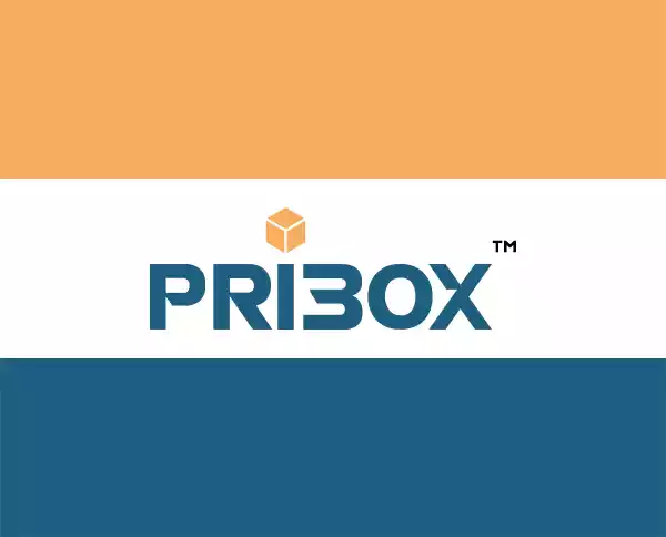
Brand colors were recommended to be kept as a combination of subtle and stark. These are to be used in a specific ratio and proportion to bring alive the luxurious branding feel and emotion, in line with our overall brand personality.
ORANGE: effectively a dressed-up shade of brown, copper also embodies the color's warm, homely energy. A hint of red lends it a more lively energy, which is then further enhanced in its metallic form. To be used in specific places to attract attention.
BLUE: It represents neutrality and balance.Also having a look at it stable, harmonious, peaceful, calm, and trustworthy are just some of the feelings that customers will associate with the brand.
Brand Stationery Design
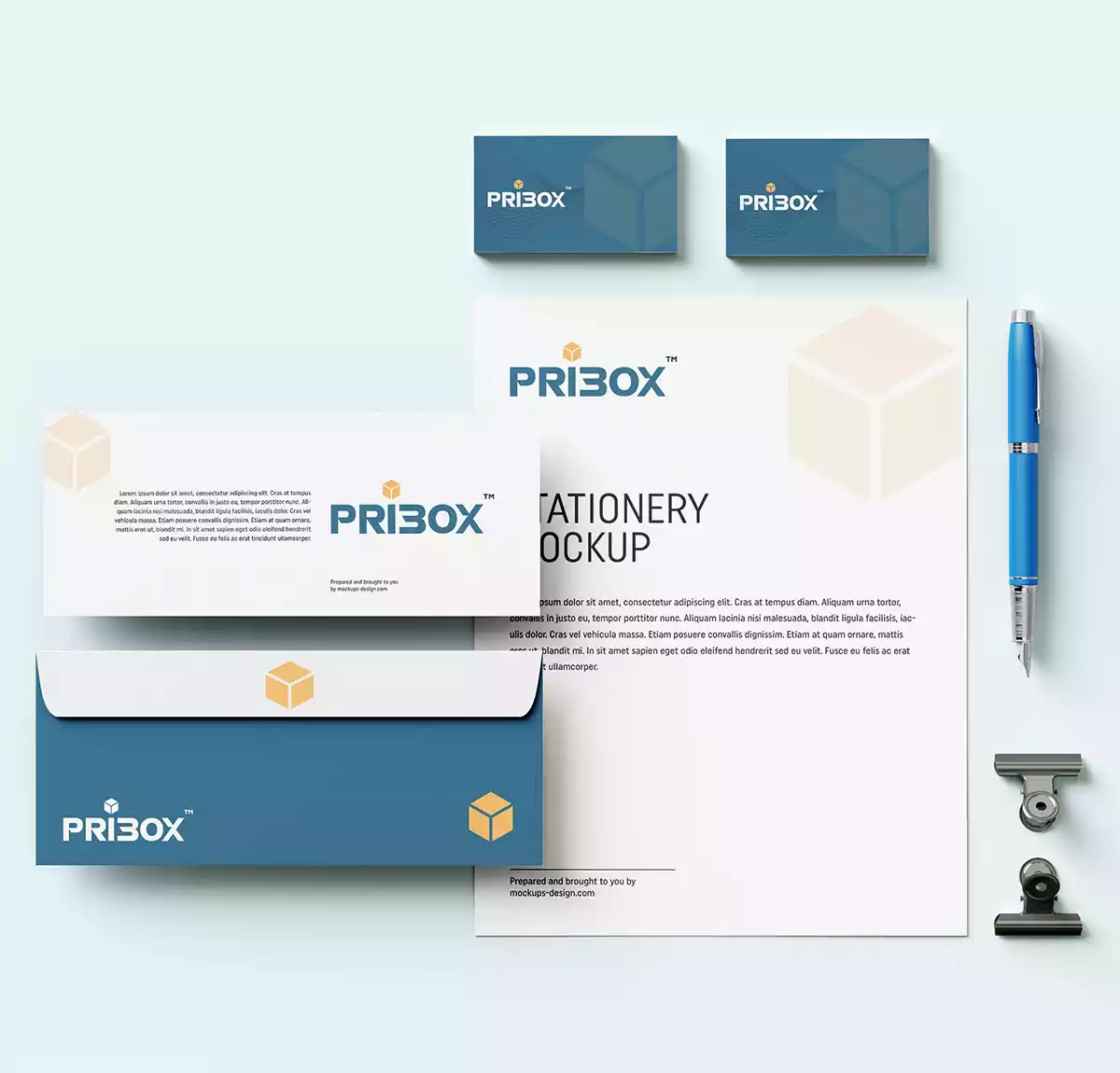
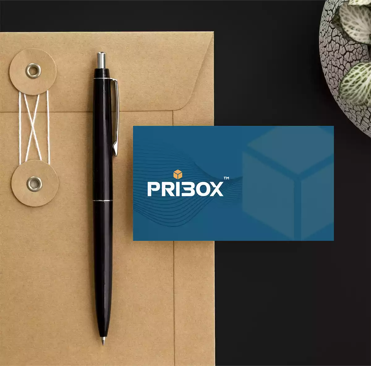
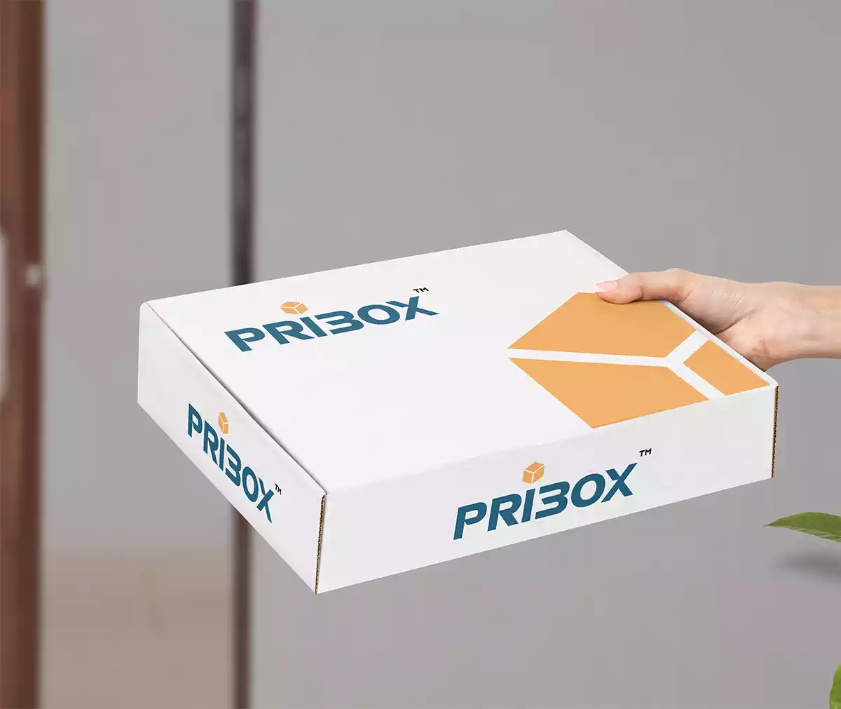
Branded stationery and collateral bring alive the brand’s essence. They help generate trust, communicate brand values, showcase professionalism, and strengthen the brand recall value at every touch point.
UI/UX Design
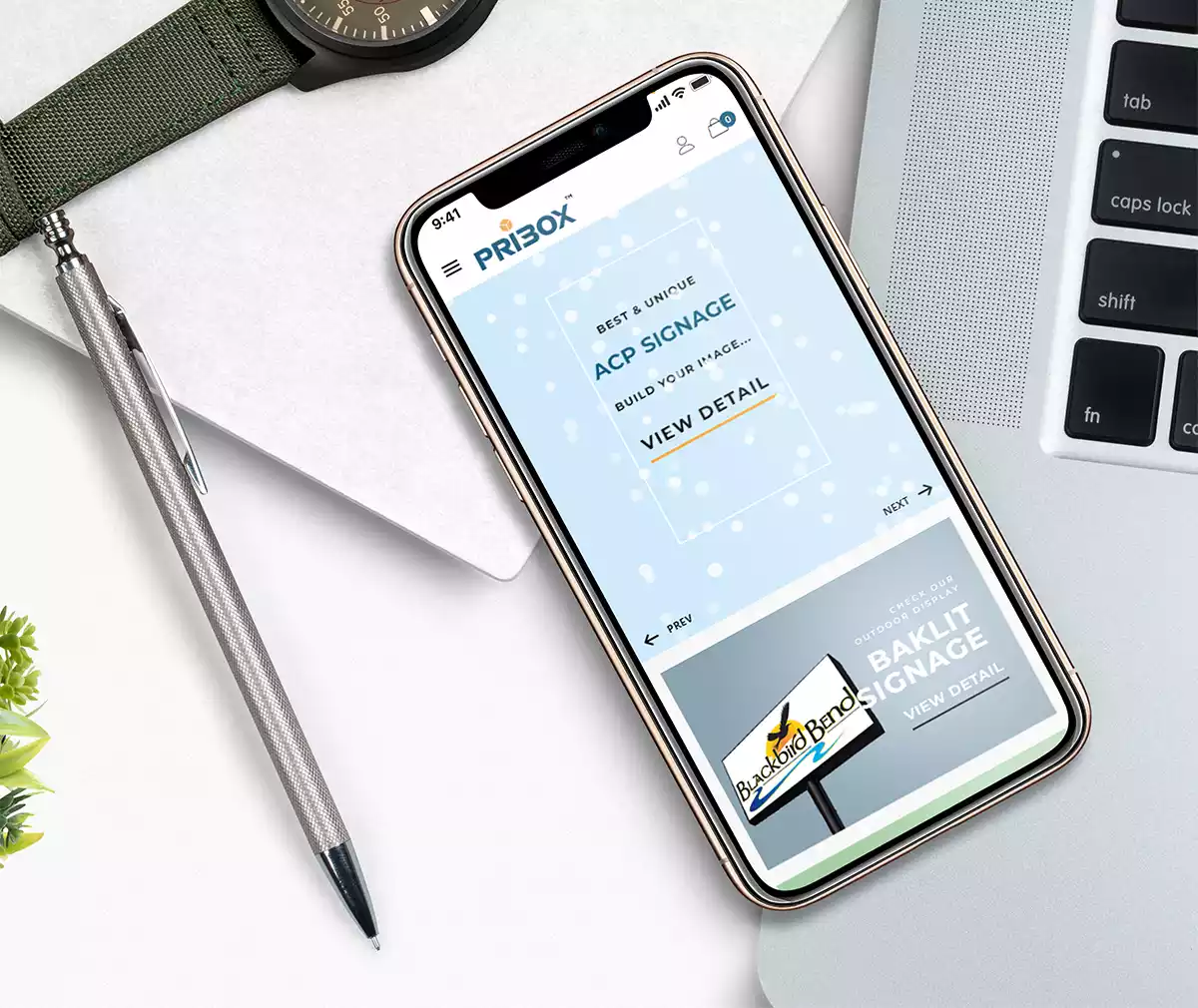
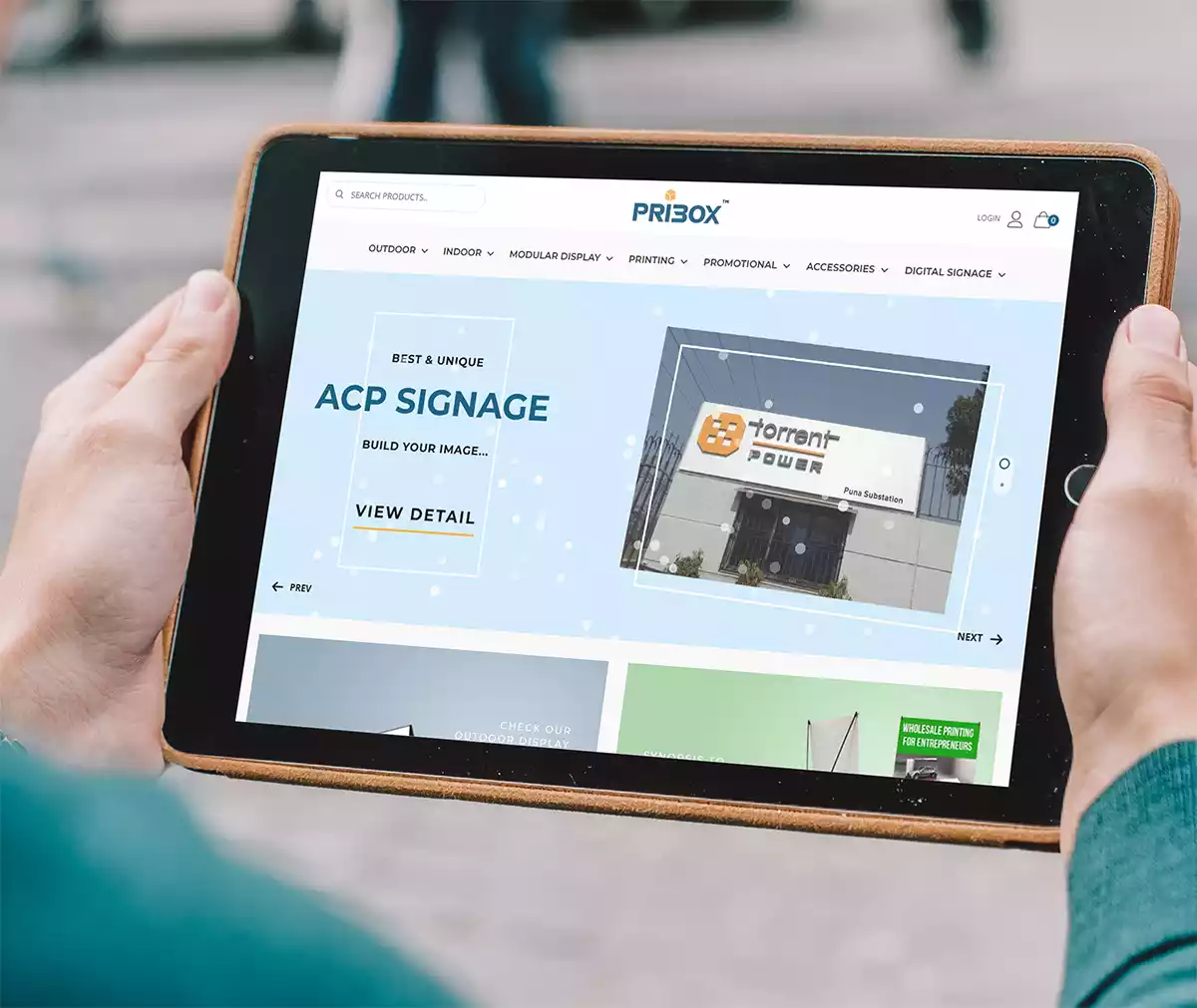
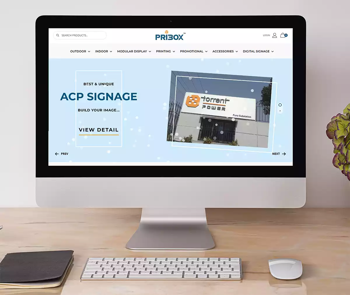
Websites are the backbone of any Business. In our case, we built a highly engaging website that showcases all their outdoor hoarding, signages, etc the work they have done in the best possible way. It was designed to build brand memorability, drive conversions, and reinforce and increase the brand’s value and customer loyalty.
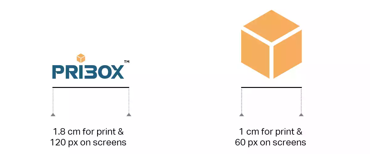
Minimum Size
The minimum sizes of brand identity applications were recommended keeping in mind that brand visibility and legibility are never compromised.
Brand Signage Design
It is important to reach the right customers and an eye-catching signage design helps the customer know where the clinic is located. Unlike other means of advertising like radio, TV, and newspaper, signage is cost-effective.
