BRAND NAME / BRAND IDENTITY DESIGN / BRAND EXPRESSION SYSTEM / PRODUCT PACKAGING DESIGN
Women’s Luxury Cosmetic & Skincare
Branding Case Study
Project Background: Pretty Xo is an International Brand for Women’s Cosmetic & Skincare Products. Redefining the modern age women and addressing their skin issues the founders wanted to create a Brand which only makes the finest quality vegan cosmetics specifically designed for female skin. The founder, Mr. Jigar Shah approached Popway for the branding of the company. The brief was to bring alive a sense of purity and a natural feel, keeping the focus on female beauty to daily care.

Brand Archetype
The Caregiver
The caregiver is the Brand that protects others from the harm & makes them feel cared for. They offer their customers a sense of safety and comfort. They devote themselves to bettering its customers and the planet.
VALUES: Well Being / Compassion / Empathy / High End Quality
BRAND PERSONALITY: Caring / Optimistic / Generous / Friendly / Nurturing
Brand Naming
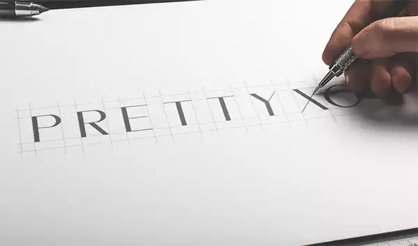
The founder wanted to name their brand something unique & trendy so we suggested the name “Pretty Xo”. The word pretty itself means beautiful and XO means "hugs and kisses” where the X represents a kiss, while the O represents a hug. The thought was to give women a feeling of pretty and confident when anyone hears the name of this Brand.
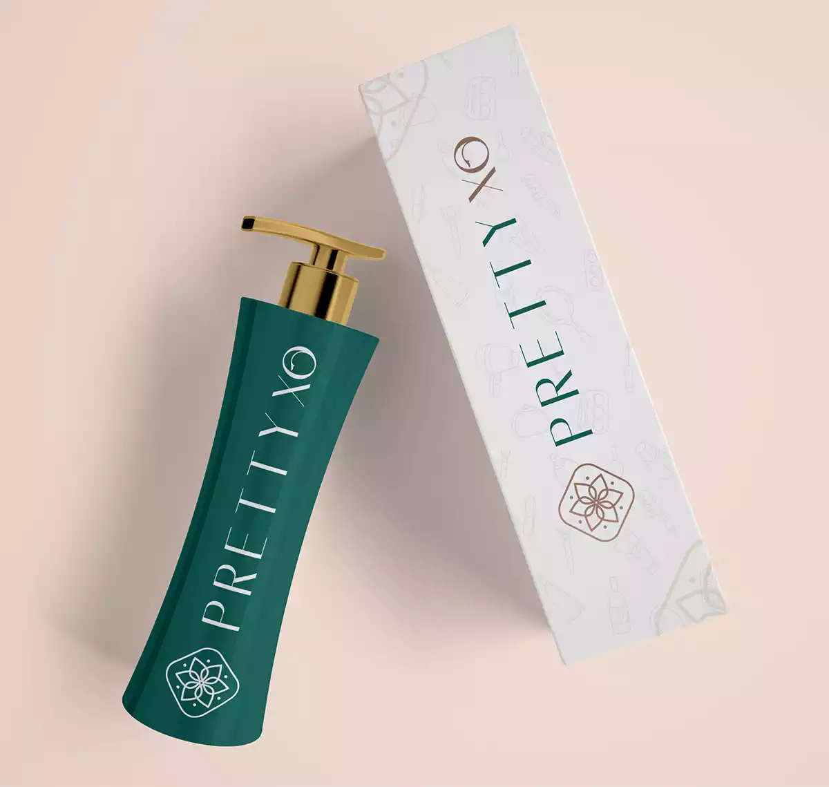
Brand Identity
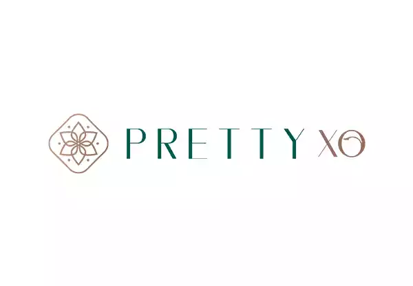
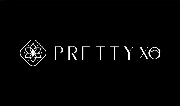
The Logo was designed to exude trust & purity, in alignment with the women’s skincare branding strategy. The typefaces were crafted to be smooth, aesthetically pleasing, and inviting, in line with the cosmetics and skincare branding strategy. The combination of font & icon was used to create a visual impact in the eyes of the viewer. Spacious & Distinct fonts were used to provide complete visibility. The Icon was designed in such a pattern which reflects nature along with the soothing vibes & trust. The design done inside the O letter gives finishing touch to the Logo.
LOOK: Premium & Minimal but Informative
FEEL: Pure, Natural & Elegant


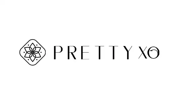
Logo Variation
Here, We have displayed the options where the logo can be used in multiple variants as per the needs.
Brand Color Palette
The brand color palette was recommended to bring alive the emotions we wanted to evoke for cosmetic and skincare branding, i.e., feelings of freshness, purity, and nature. The unique color palette was designed to make the cosmetic and skincare brand stand out in the category and look premium.
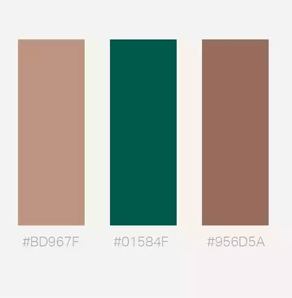
Browns (#BD967F & #BD967F): Brown is associated with Earth. It’s soothing, brings peace, balance, sustainability, harmony and restoration to mind. It provides you a sense of duty & responsibility as well as it takes its obligation seriously. It encourages a strong need for security and a sense of belonging for everyone.
Green (): The color of wealth, luxury & professionalism. The color green is a serious color signifying balanced & calming design of the packaging. It reflects the sense of caring and shows the products are natural & organic, curated by keeping the care of quality and utmost need.
Brand Typography Design
We chose the font family to bring alive the emotions of purity and premium quality. The minimal choice of text style was selected to achieve this and connect consumers to the very core of the brand.
Font: Kammerlander
Type Rules

Overview

Letters

Numbers

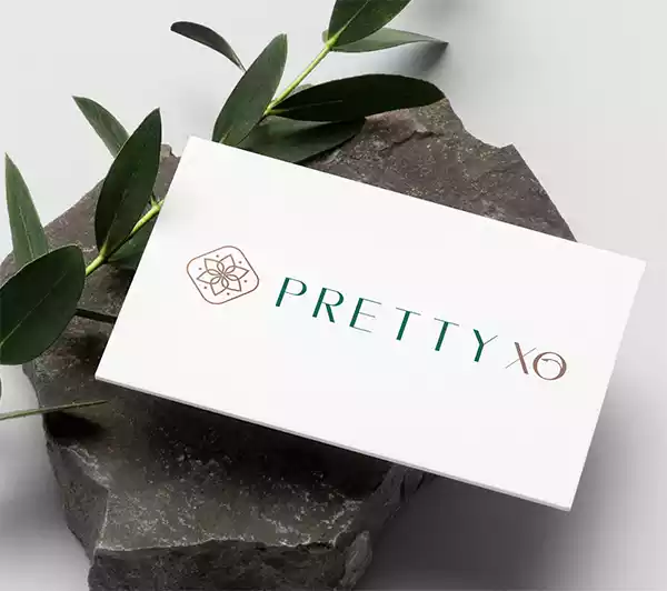
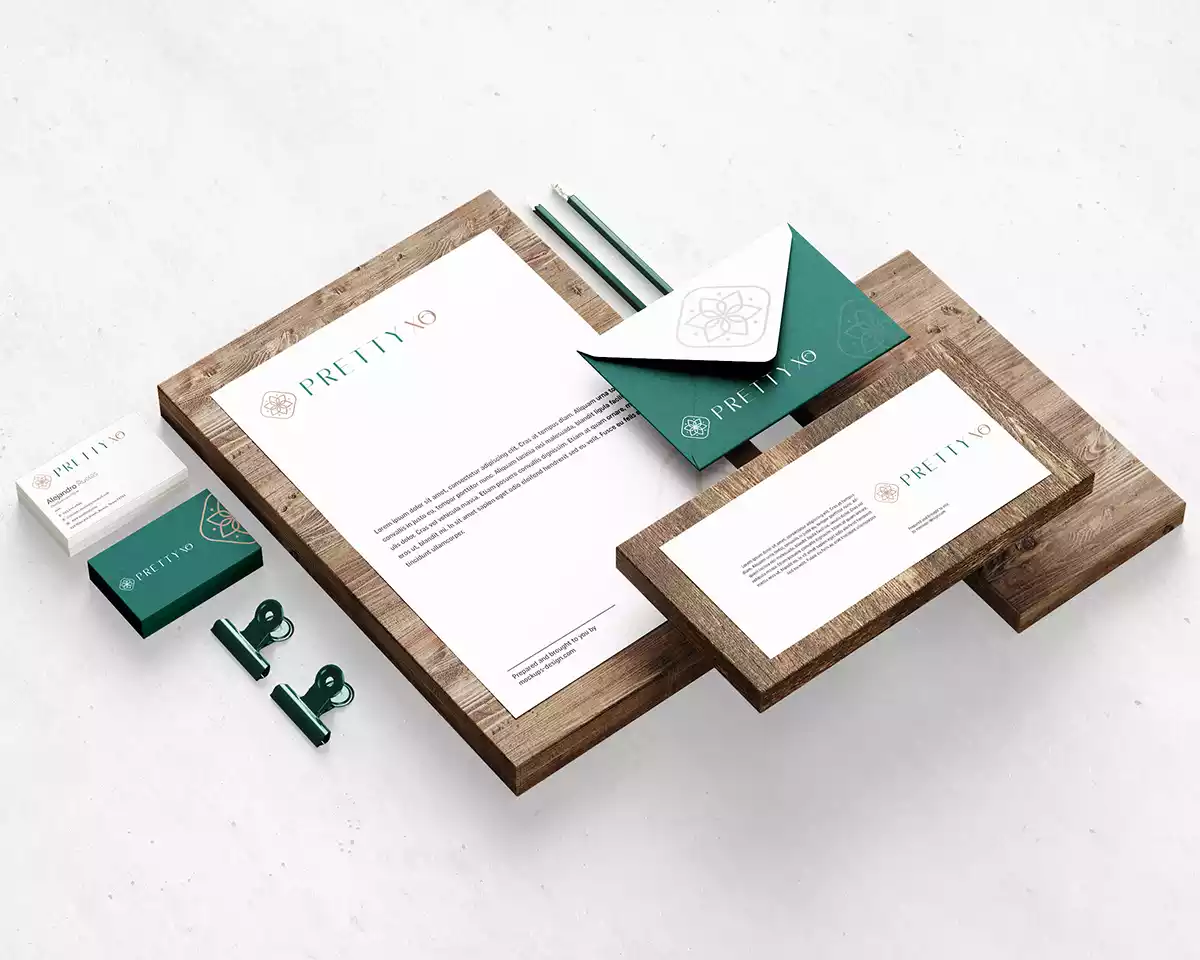
Brand Stationery Design
Branded stationery and collateral bring alive the brand’s essence. They help generate trust, communicate the brand values, showcase professionalism, and strengthen the brand recall value at every touch point.
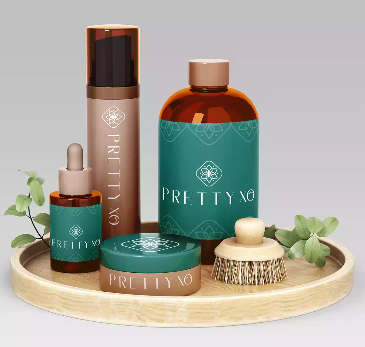
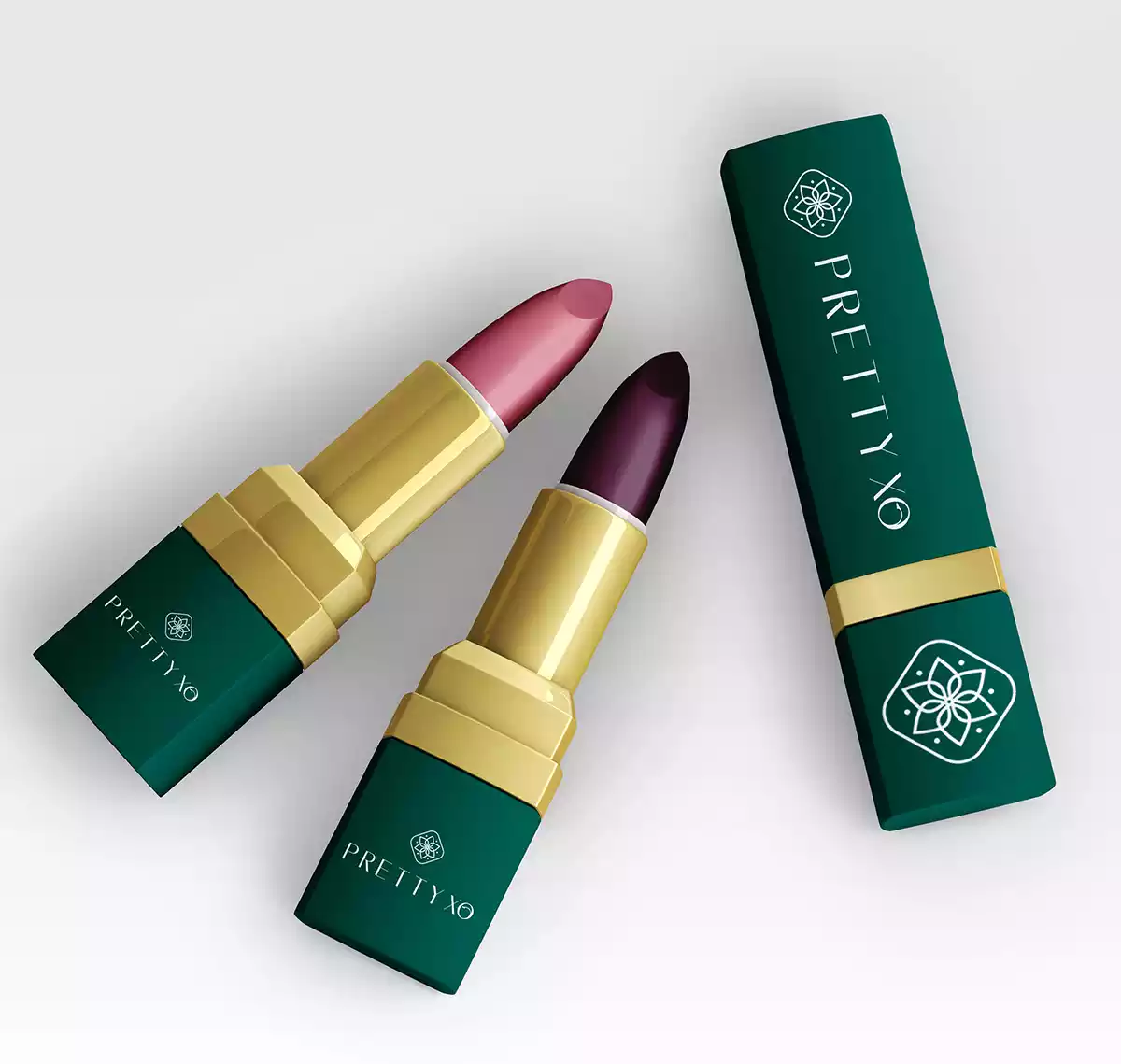
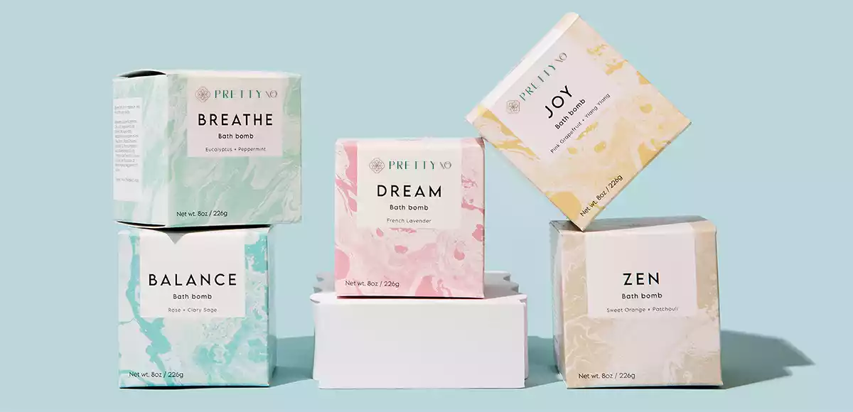
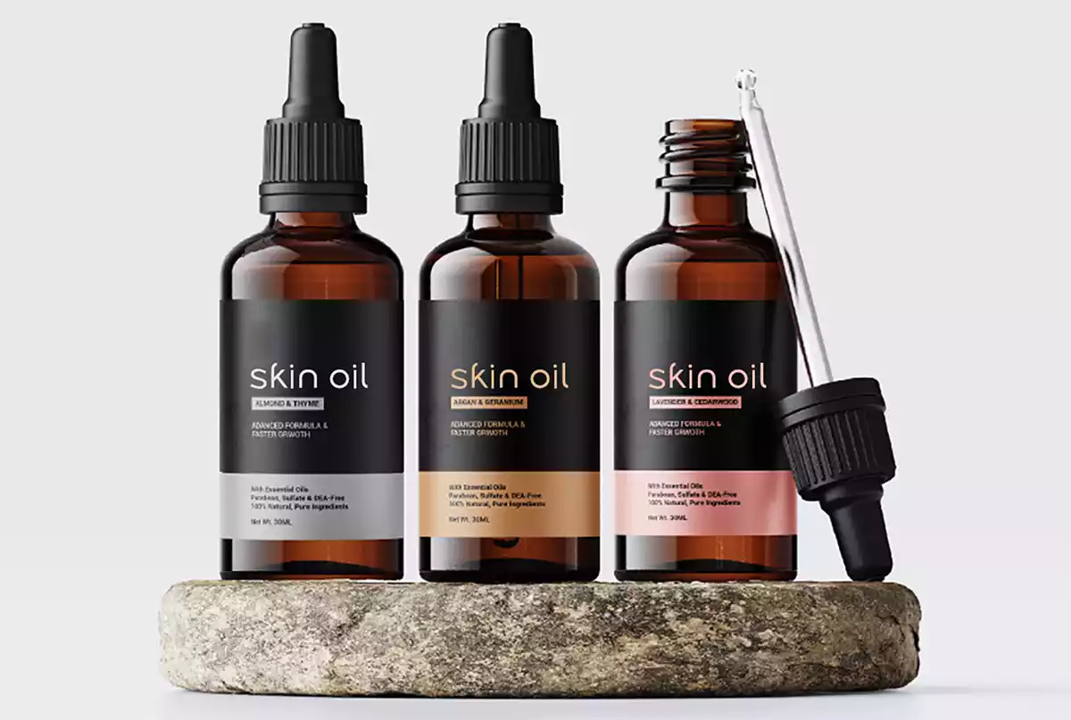
Product Packaging Design
We use design as a tool to increase the product’s value and enhance the brand image. The skincare product packaging design was done to outshine the brand’s competition, generate trust, and persuade shoppers to purchase the offerings. We studied the product selling cycle and the target audience’s buying mindset and crafted the product branding strategy and packaging look and feel strategy. The branding strategy included defining the prioritization of the elements of packaging/content for the desired eye movements of the customer. The packaging strategy and design worked highly well for the cosmetic and skincare brand on e-commerce portals with high conversion rates at giants like Amazon, Flipkart, Nykaa, etc.
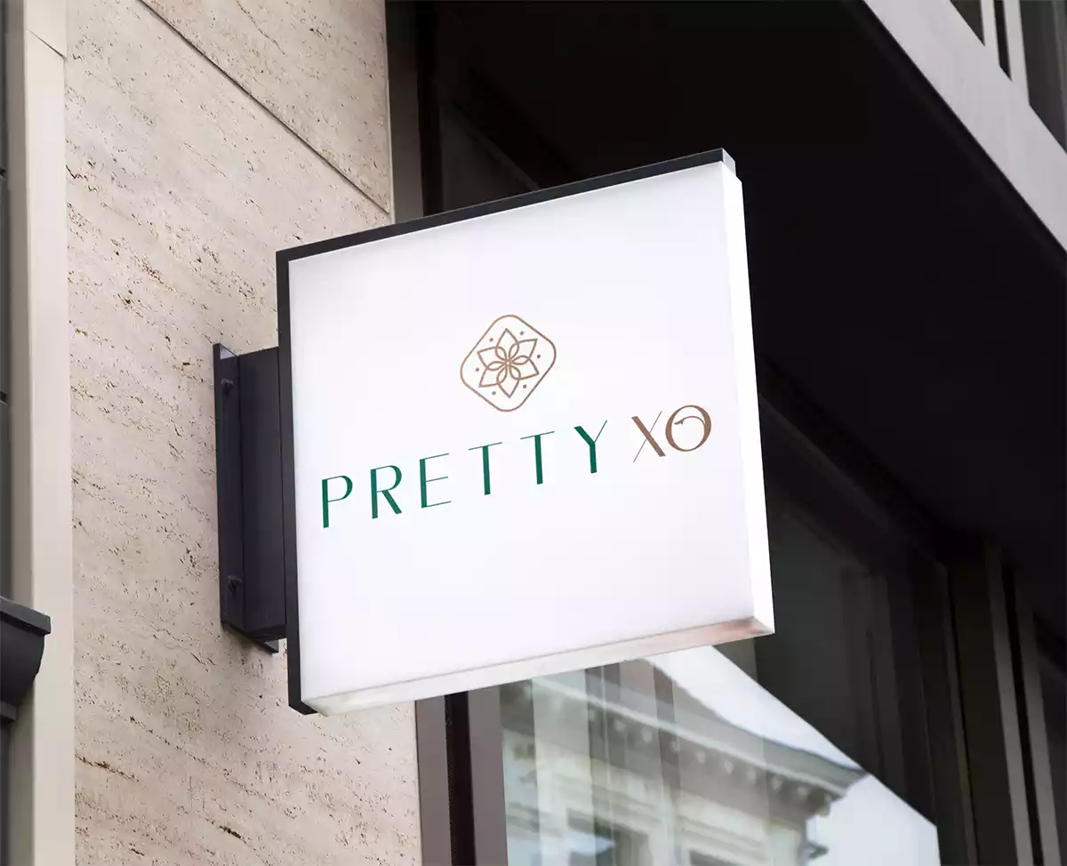
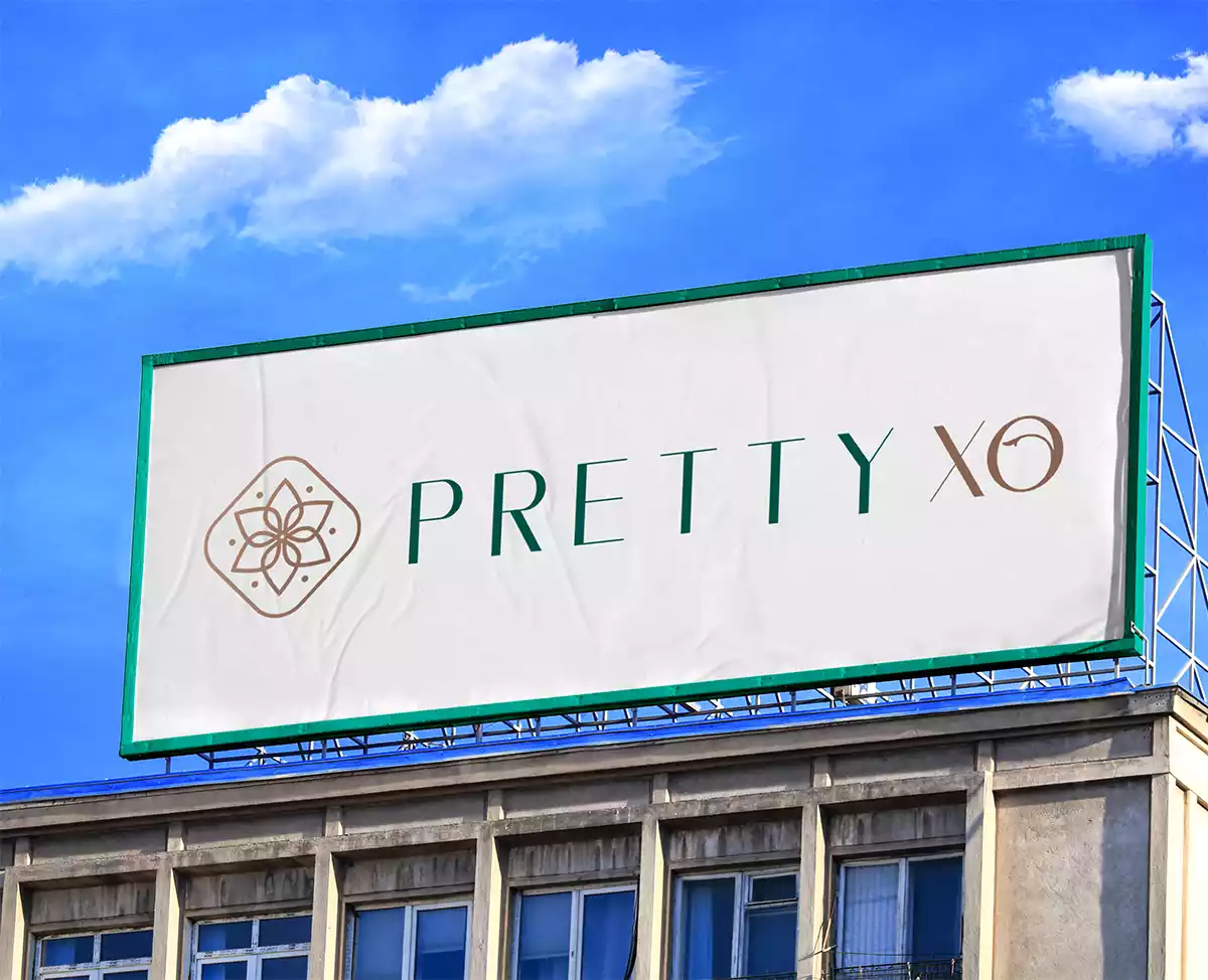
Brand Signage & Hoarding Design
It is important to reach the right customers and an eye-catching signage design helps to attract more customers & tell them where the company office is located. Unlike other means of advertising like radio, TV, and newspaper, signage is cost-effective. Backlit sleek square company signage was designed with the purpose of ensuring high visibility and recall at the brand’s touch-point.