BRAND NAME / BRAND IDENTITY DESIGN / BRAND EXPRESSION SYSTEM / PRODUCT PACKAGING DESIGN
Italian Bakery
Branding Case Study
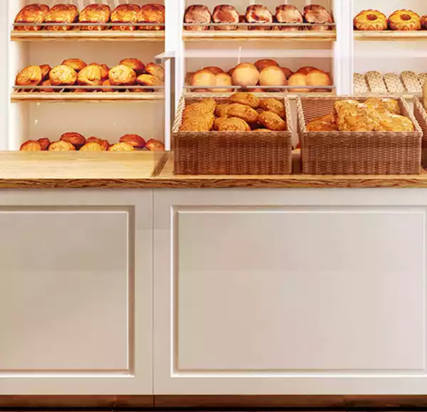
Project Background: D2D is an Italian Bakery, a startup bakery located in the US. D2D bakes everything from customized cake to pastries to cake jars to desserts & many more. The owner approached us for the branding of the D2D Bakery. Having grown up with the passion of Bakery she wanted to bring the homely touch to the Bakery. She wanted to design a place where customers can get the vibe of liveliness & well being.
Brand Archetype
The Innocent
An Innocent brand is one that is optimistic, honest, and virtuous. They always try to create experiences that bring joy & peace to other’s lives. They are really honest & pure and have no ill will towards anyone. They have only 1 purpose and that is to bring happiness to everyone.
Brand Personality: Generous, Honest, Caring & Compassionate
Brand Naming
The Brand name “Dough to Door” was designed based on the idea of the services they are providing to their customers. The was to finalize a unique name which can create an Aura of professional yet caring Brand which helps their customers by bringing joy in their life & where people can easily understand & relate to their products. Our team suggested the idea of Dough To Door Bakery as it itself says we deliver your favorite bakery products to your door with utmost care & love.
Brand Identity
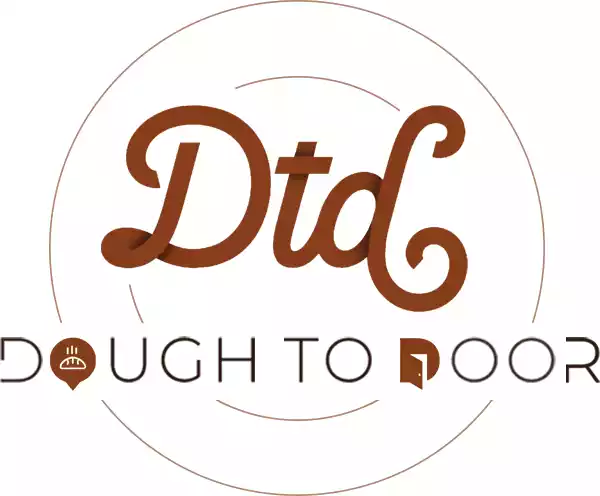
The Logo is the signature of the initials of the Brand Name because that’s how we wanted the Brand Name to get popular among the audience. The Logo was aesthetically designed to relate with its products. The icon was designed to exude elegance. The fonts were given a curvy touch to bring liveliness & natural feel to the Brand. Fonts were curated & designed by us to go well with our hand cooked delicacies & go well with our hand curated natural & organic curves of the cakes, breads, drinks. The circles were curated to add wholeness, originality, perfection & timelessness.
LOOK & FEEL: Simple & Elegant
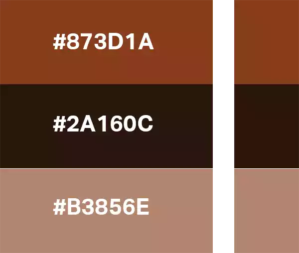
Brand Color Palette
Since the brand is an Italian bakery, i.e. in food-related business, we wanted to evoke a sense of hunger and taste while looking beautiful and elegant. So we recommended choosing from the earthy shades to bring the earthy feel with this modern brand. Also earthy color group shades are the most satisfying color groups to work with. Also the subtle hues were chosen to bring a natural feel to the Italian bakery and its branding.
Brand Typography Family
Here, the typography is the major element for this business as it literally communicates with the customers, so choosing the right font to reflect the Italian Brand Personality was necessary for communicating the right message with the audience. Also it plays a very essential role in Menu Card Design, Hoardings & Advertisement related communications. That’s why the perfectly curated fonts were chosen to bring elegance & to add every possible character of the Italian Language.
Brocades
Script Regular


Lobster
Heading


Freud Light
Subheadings


Brand Typography Construction

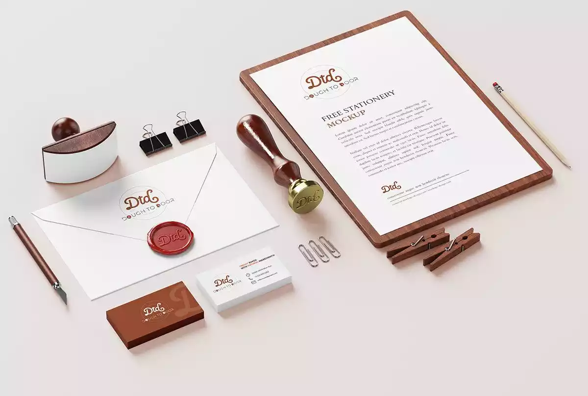
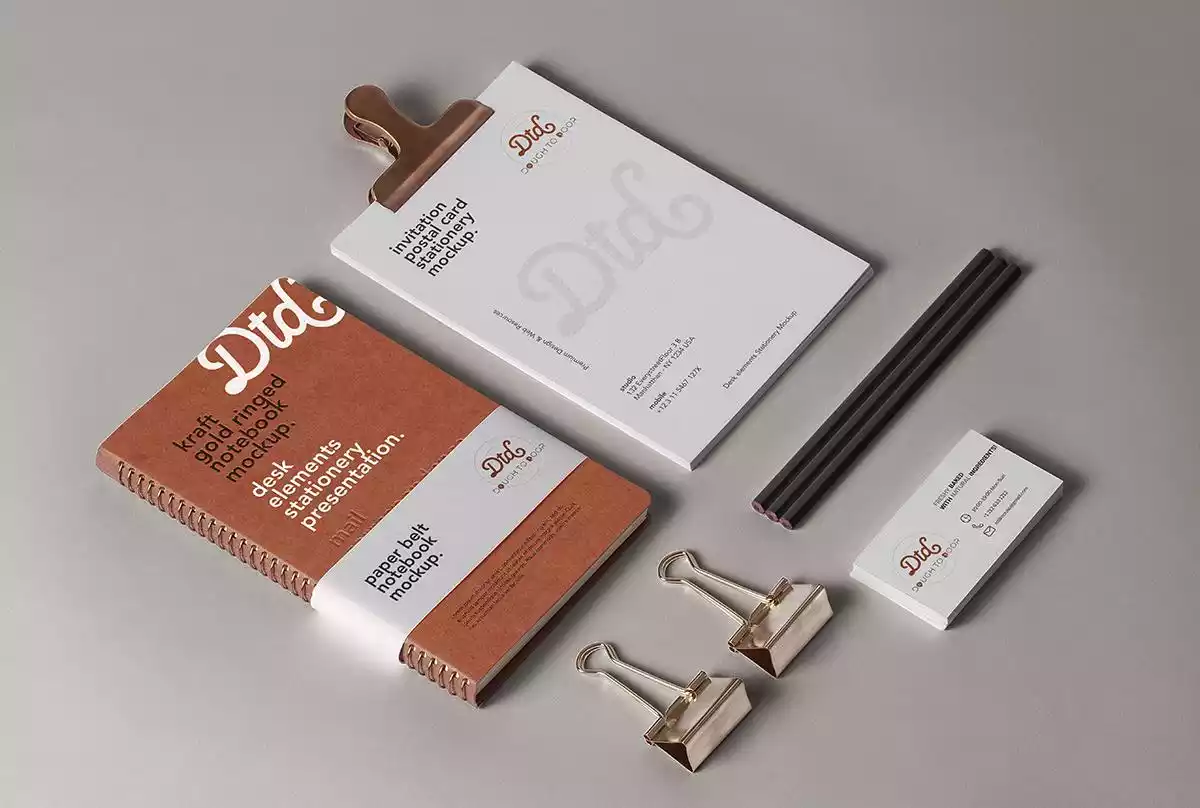
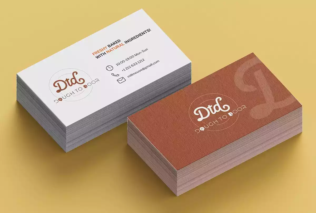
Brand Stationery Design
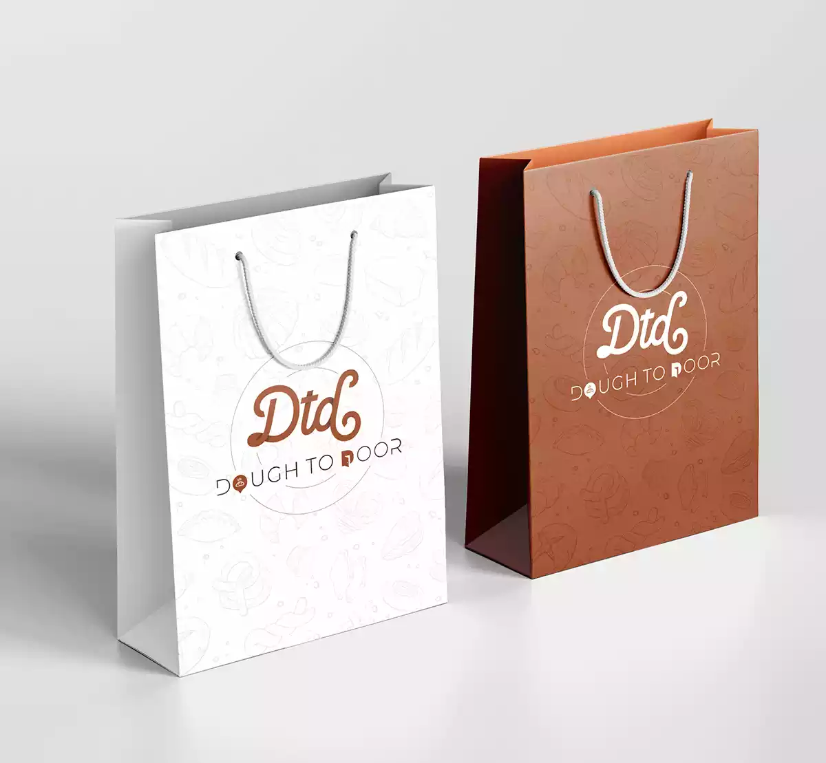
Branded stationery and collateral bring alive the brand’s essence. They help generate trust, communicate the brand values, showcase professionalism, and strengthen the brand recall value at every touch point.
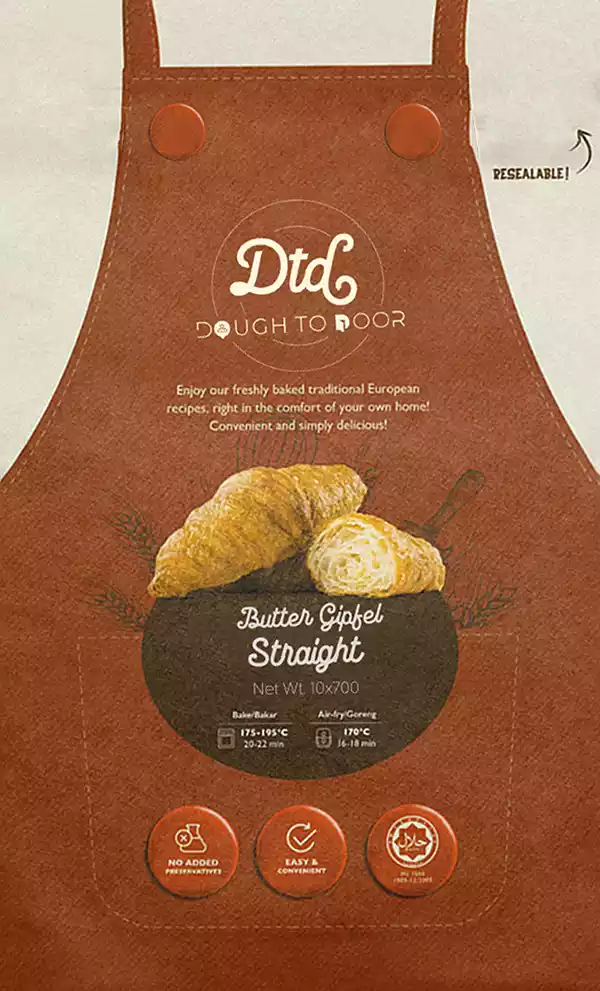
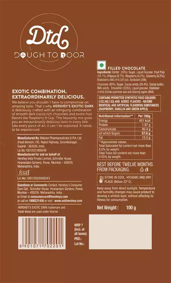
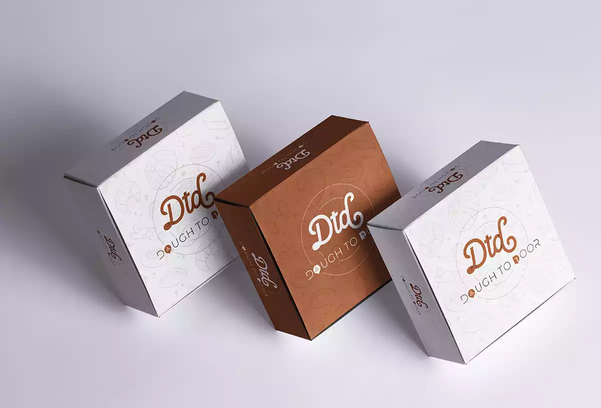
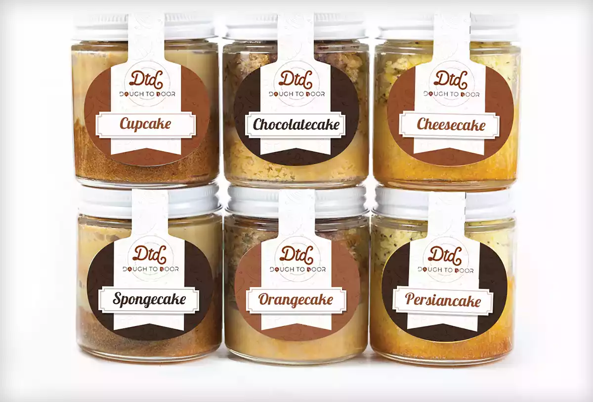
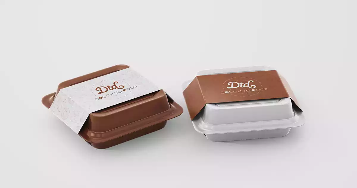
Packaging Label Design
We use design as a tool to increase the product’s value and enhance the brand image. Our packaging designs outshine the brand’s competition, generate trust, and persuade shoppers to purchase the offerings.
Front
Back
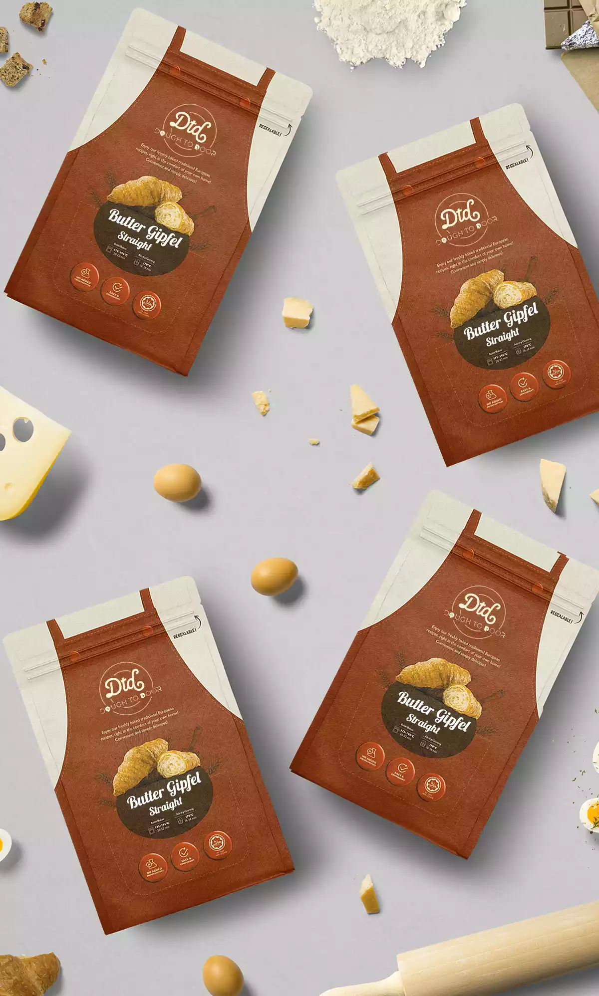
Product Photoshoot
Product mockup builds desired value in the world of digital commerce. Brand imagery guidelines and product listing images are key to conversion.
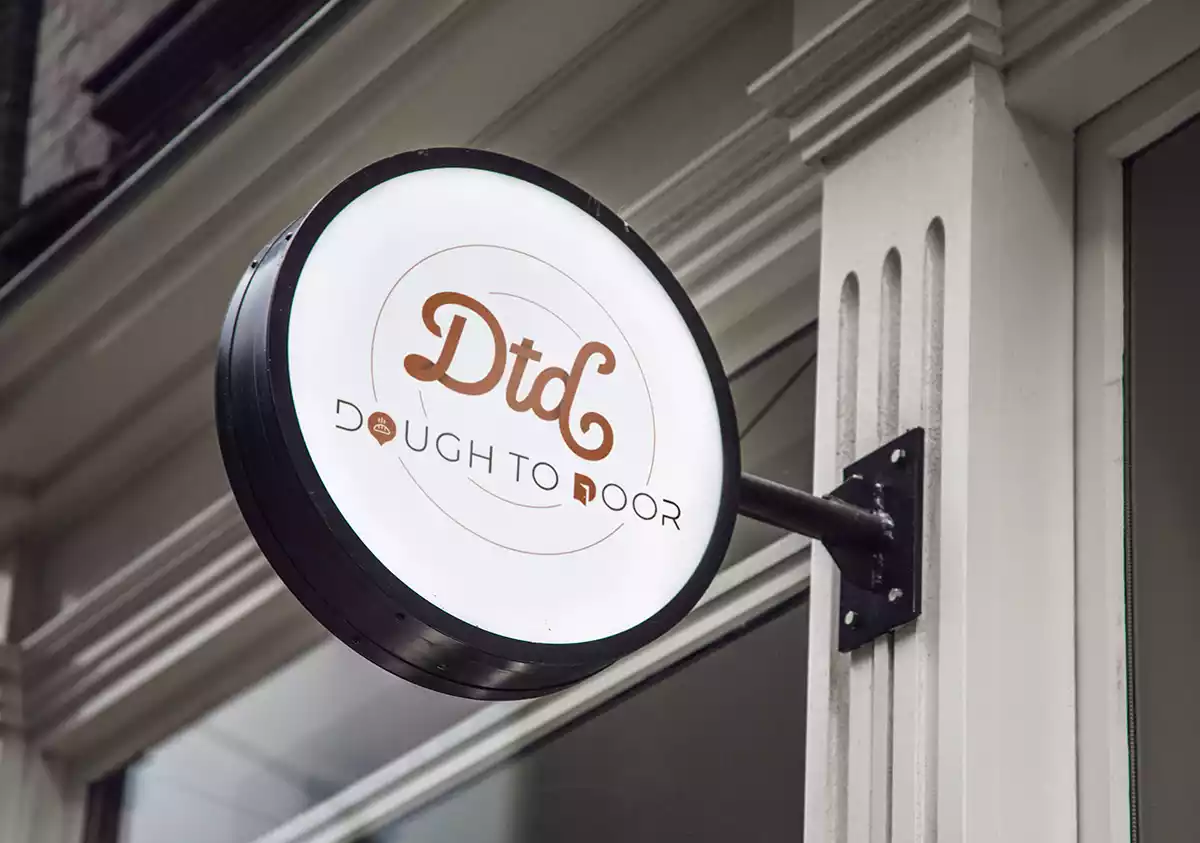
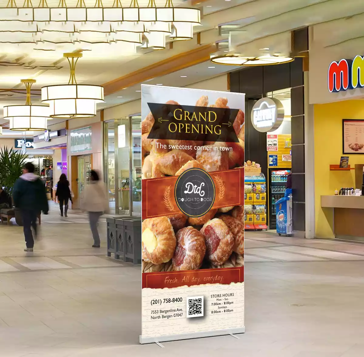
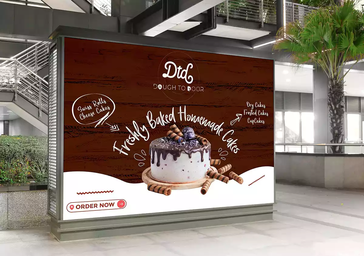
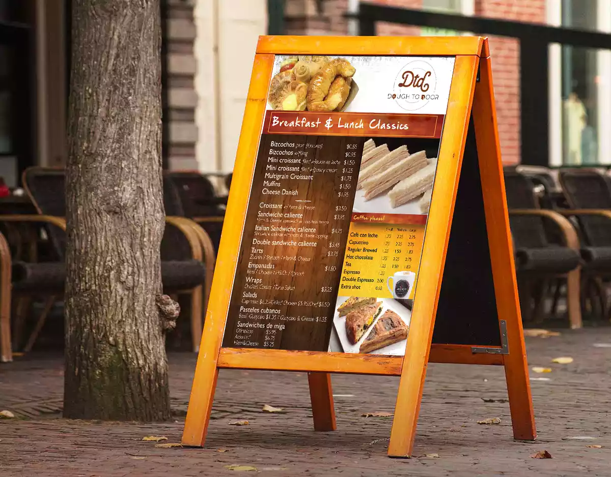
Brand Signage, Banner & Hoarding Design
It is important to reach the right customers and an eye-catching signage design helps to attract more customers & tell them where the company office is located. Unlike other means of advertising like radio, TV, and newspaper, signage is cost-effective. Backlit sleek square company signage was designed with the purpose of ensuring high visibility and recall at the brand’s touch-point.
Some Featured Works


