BRAND NAME / BRAND IDENTITY DESIGN / BRAND EXPRESSION SYSTEM / PACKAGING DESIGN / PHOTO SHOOT / WEBSITE DESIGN
Packaged Food
FMCG Company
Branding Case Study

Project Background: Chuski Bite is a brand to be launched soon in the Indian market by Shanta G Khakhra.’, a company based out of Surat, Gujarat, India. The Owner of Shanta G Khakhra approached Popway Innovations LLP to design a new unique name as well as the identity of their new brand. Chuski Bite is a Brand one of its kind. They wanted to make a premium yet affordable brand by everyone. The Brand will deal in snacks with a drink of your choice. It will itself be a whole meal which anyone can have anywhere, anytime as well as easy to prepare.

Brand Archetype
The Jester
The Jester is a mischievous personality who believes in bringing enjoyment in every stage of life. They live without restraint and shine with unrelenting confidence. They are young at heart and don't take life too seriously. Ultimately they want everyone around them to be happy & always try something new.
The Brand is Modern/ Value for Money / High Quality / Unique
BRAND LOOK: Minimal / Clean / Subtle
BRAND FEEL: Premium / Healthy / Hygienic
Brand Naming
The Brand Name “Chuski Bite” was recommended because it is fun, mischievous & highly relatable with the Brand. The name was designed instantly to create an Aura of premium quality snacks that is really healthy, dependable & can help you uplift your mood anytime, anywhere by fulfilling hunger. The word “Chuski '' was used in Logo to give a feel of Drink & the word “Bite” itself explains the munching of the snacks on the go. It together explains the Snacks you can carry with your desired drink anywhere, anytime.

Brand Identity
The Brand Logo was designed to bring alive the fun it was representing. It was designed in such a way as it can communicate itself with the audience about the product. The FMCG Logo was specifically designed on Font Basis for simplicity & high visibility. The curvy fonts were used with en effect to give Brand a fun effect. And the red oval shape was used to highlight the Brand Name by keeping it warm & eye catchy. Supported yellow curves were designed to give a feel of wholesomeness & signature feel.
RECOMMENDED LOGO TYPE: Combination Mark Type.


Brand Typography
The recommended font were chosen to convey professionalism, and superior quality and build up trust. The choice of a text style has huge impact on consumer's mindset and make them connect with the very core of the brand. we also customize font according the brand needs.
Ganache
Basic


Brand Typography Construction

Brand Color Palette
The Brand Color represents Food & the feeling we wanted to evoke is hunger, healthy, reliability to satisfy your hunger anywhere, anytime. The Broad Idea was to include the color that represents Food + Health + Reliable.

White portrays feelings of cleanliness, purity, and simplicity, and when used in packaging usually makes people think that the product does not contain many ingredients that can affect their health.

According to research, red is eye-catching and triggers appetite. It's useful for Logo design of food brands as it is also associated with passion and love while it comes to food.

Happiness: Yellow is the bright color that makes consumers feel happy & gives a positive vibe about the brand. As such, yellow tends to evoke optimism and general good feelings.
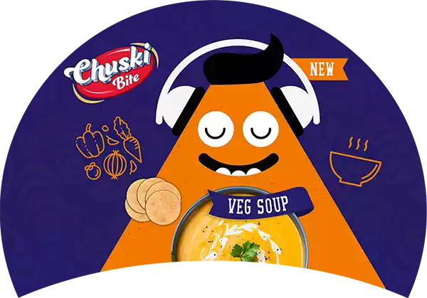
Packaging Label Design
We use design as a tool to increase the product’s value and enhance the brand image. Our packaging designs outshine the brand’s competition, generate trust, and persuade shoppers to purchase the offerings.


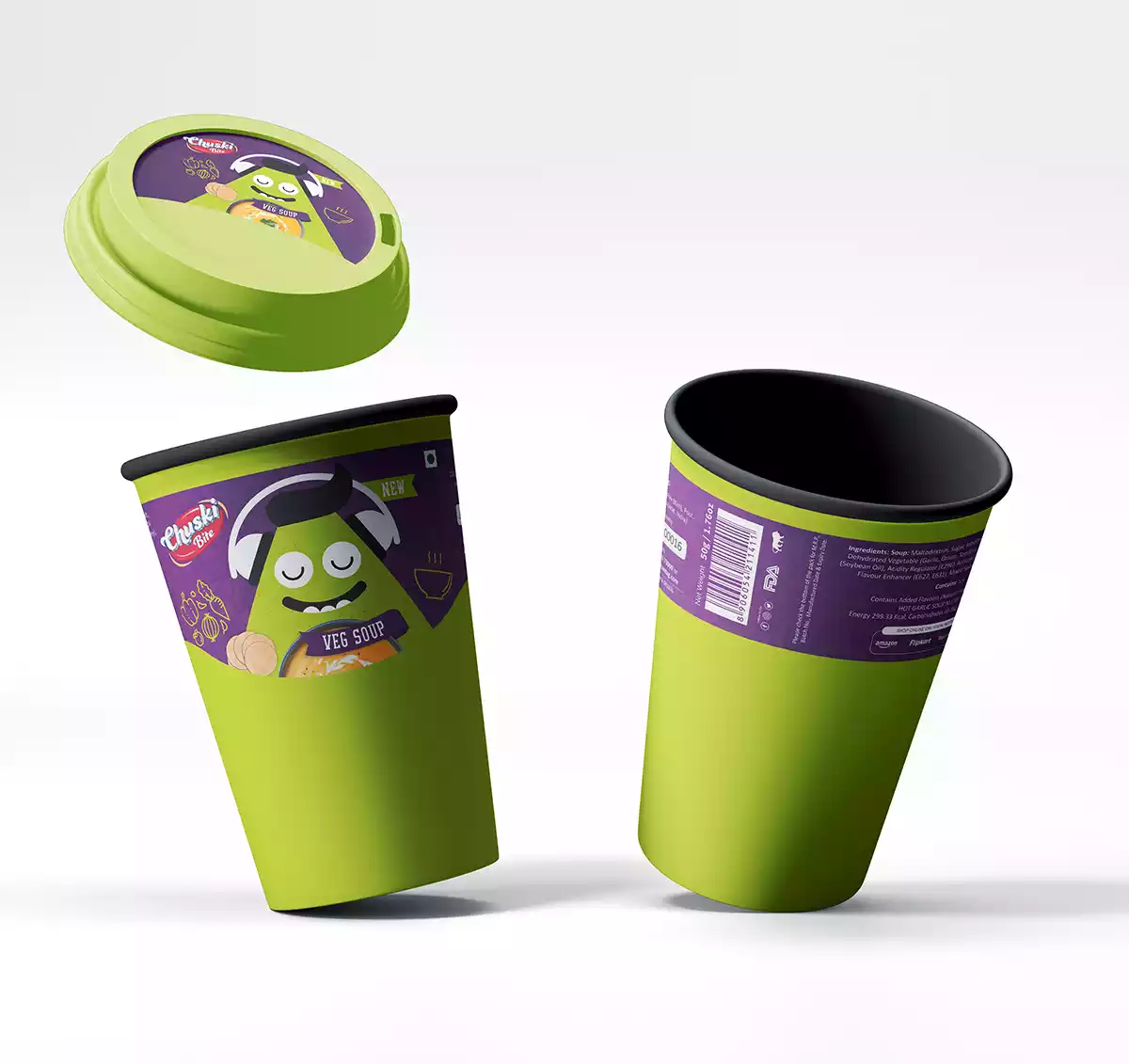
Product Photoshoot
Product mockup builds desired value in the world of digital commerce. Brand imagery guidelines and product listing images are key to conversion.


Brand Signage Design
It is important to reach the right customers and an eye-catching signage design helps to attract more customers & tell them where the company office is located. Unlike other means of advertising like radio, TV, and newspaper, signage is cost-effective. Backlit sleek square company signage was designed with the purpose of ensuring high visibility and recall at the brand’s touch-point.


Some Featured Works


