


Best Dashboard UI Design Trends for Businesses in 2026
Table of Content
1. Introduction
2. Why Dashboard Design Is a Business Problem, Not Just a Tech One
3. Trends That Are Actually Changing How Businesses Operate
4. The Real Connection Between Design and Data-Driven Decision Making
5. Custom Development vs. Off-the-Shelf Tools
6. What Separates a Good Dashboard From a Great One
7. Conclusion
Introduction
Most business owners only think about their dashboard when something breaks. A report takes too long. Someone misreads a chart. A decision gets delayed because nobody could find the right number fast enough.
That's the quiet cost of poor Dashboard UI Design - and it happens more than people admit.
The good news is that dashboard design has genuinely evolved. What used to be a wall of tables and graphs has become something teams actually want to open. Here's what's working right now for modern businesses.
Why Dashboard Design Is a Business Problem, Not Just a Tech One
Most dashboards are built by developers, for developers. The people who use them daily - sales managers, operations leads, finance teams - often get something that technically works but practically frustrates.
User Experience Design in dashboards is not about making things look good. It's about making sure the right person sees the right information at the right moment, without having to dig. When that works, teams move faster. When it doesn't, you get bottlenecks that get mislabeled as data problems.
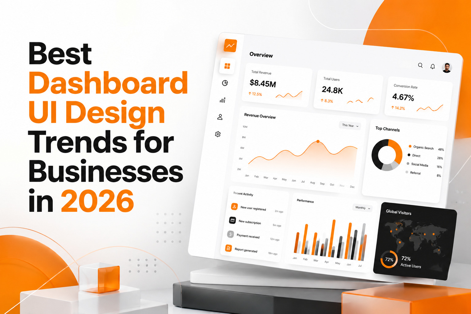
Trends That Are Actually Changing How Businesses Operate
Less Clutter, More Clarity
BI dashboards are moving toward less, not more - fewer
metrics, cleaner layouts, one clear action per view.
The old instinct was to show everything. The new
standard is to show only what drives a decision.
Simplicity looks easy but isn't - you can't strip a
dashboard down without first understanding the business deeply.
Most teams build dashboards around available data. The
better approach is to start with the decision, then find the data that serves it.
A cluttered dashboard isn't an information problem. It's
a prioritization problem.
Mobile Is Where Real Decisions Happen
People don't wait for a desk anymore - decisions happen
between meetings, in warehouses, on the go.
A desktop dashboard squeezed onto a phone isn't mobile.
It's just small and frustrating.
Layout, font sizes, tap targets, how content stacks -
all of it needs a rethink, not a resize.
When mobile is done right, teams check their numbers far
more often. That alone changes how fast decisions get made.
Role-Based Views People Actually Need
A customer success rep and a CFO are solving completely
different problems. Their dashboards shouldn't look the same.
Most tools still default to one view for everyone.
That's a design failure, not a feature gap.
The right question isn't "what data do we have?" It's
"who opens this, and what decision are they making?"
Role-specific views, saved filters, and personalized
layouts aren't extras anymore. They're the baseline.
When someone sees only what's relevant to them, they
move faster and second-guess less.
Real-Time Data Without the Stress
Live updates look great in demos. In practice, a screen
that's constantly refreshing and flashing new numbers makes people anxious rather than informed.
Good Data Analytics Dashboard design handles this
carefully - subtle indicators, color changes that carry specific meaning, alerts that only fire when
a real threshold is crossed. The goal is steady awareness, not constant alarm.
Dark Mode and Display Control
What started as a visual preference became a real
productivity feature. Teams using Business Intelligence Tools across long shifts, low-light
environments, or multiple time zones genuinely benefit from dark mode and adjustable contrast
settings.
More than that, giving users control over display builds
trust in the product. It tells them someone thought about their comfort, not just the database
behind the screen.
Tooltips That Actually Explain Things
Not everyone on a business team has an analytics
background.
When someone hovers over a metric and gets a
plain-English explanation - what it means, where the number comes from, what a shift in either
direction would suggest - that's Web Application Development done right.
Dashboards that help users understand what they're seeing get used consistently. Dashboards that assume everyone already knows don't.
Start your project on the right foot
A project discovery stage can help you avoid building the wrong product, and we can help you get the discovery stage right. Let’s start with a free call.
The Real Connection Between Design and Data-Driven Decision Making
Data-Driven Decision Making gets talked about constantly. But it only actually happens when the people making decisions can reach their data quickly and trust what they see.
Design is what makes that possible or impossible. A well-built Business Intelligence Dashboard replaces the question "where do I even look?" with immediate clarity. People stop second-guessing numbers and start acting on them. That shift in confidence comes from design - not just from having more data sitting in a warehouse somewhere.
Custom Development vs. Off-the-Shelf Tools
Pre-built platforms have real value. They're fast to set up, reasonably priced, and fine for many use cases. But they're built for a wide audience, which means they're perfectly optimized for nobody in particular.
Custom Software Development makes sense when your workflows are specific, your KPIs don't fit standard templates, or your team has outgrown what a generic tool can show them. The investment is higher upfront. So is the difference in how regularly people actually use what was built around their real work instead of around a product roadmap they had no say in.
What Separates a Good Dashboard From a Great One
A great Data Analytics Dashboard doesn't feel like a tool. It feels like a clear window into the business. It loads fast, says something useful immediately, and doesn't need a training session to understand.
That means consistent color meaning across every screen, error messages that guide instead of just blocking, and accessibility built in from the start — not added at the end.
Conclusion
If your team avoids the dashboard or only opens it when someone asks, that's real feedback. Not about your data. About the design.
The businesses getting the most from Dashboard UI Design aren't the ones with the most data. They're the ones who made it simple enough for people to actually use every single day.
